
Showing posts with label CiM. Show all posts

Monday, October 25, 2010

French Blue


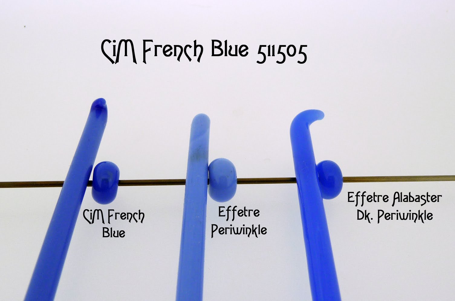
Ah, the French! Ever the trend-setters in fashion and food, masters of the language of romance-- 'sigh'! I have always wanted to travel to Paris. The Louvre seriously attracts me; I want to meet Mona Lisa someday. Until then, I will have to satisfy myself with French fries and the world's prettiest shade of periwinkle blue, French Blue by Creation is Messy. It is described on their website as "an opaque blue". I think that description needs a bit of fleshing out. French Blue is a seriously rich shade of periwinkle blue. It is very easy to work with. One of my favorite colors in glass has been Effetre Periwinkle. I use it constantly. But sometimes I want a blue with a bit more of a presence. CiM French Blue is that color. It has undeniable style and stands out in the blue family, a chic French cousin to the standard periwinkle. In the photo, you can see the depth of the French Blue compared to Effetre Periwinkle. Just for kicks, I also compared Effetre Alabaster Dark Periwinkle to the French Blue. Many people have difficulty with the alabaster colors from Effetre, unfortunately. I love these colors- they almost seem to glow with an inner light. They are neither opaque or translucent. The Effetre Alabaster Dark Periwinkle is gorgeous but a bit brighter than the CiM French Blue. But due to the somewhat cantankerous nature of the alabaster glasses, French Blue is a safer bet for a zingy blue punch to add to your designs. Vive la France!

"Judge a man by his questions rather than by his answers."- Voltaire

Pulsar


More gorgeous teals, this time of the blue variety and apparently named after something celestial. Creation is Messy has some of the most intense and saturated transparent glasses out there. Their transparent glass, Pulsar, is described on their website as "a transparent aqua blue". For me, I would have to add that it is has the richness of deep aqua that you see in the sky, high in the Rocky Mountains. It is a pure, dense teal blue with a beautiful clarity. I compared it to Effetre Dark and Light Aquamarine. As you can judge by the photo, Pulsar is similar in tone to the Effetre Aquas, but much deeper in shade. I actually do not see much of a difference between the light and dark versions of the Effetre Aquas- they look virtually interchangeable to me. The Pulsar stands out as a unique aqua shade. It is easy to work with in the flame. I experienced no pitting or color change. It plays well with silver. Love it!

"You must carry a chaos inside you to give birth to a dancing star."- Nietzsche

"The stars are the jewels of the night, and perchance surpass anything which day has to show."- Henry David Thoreau

Sunday, October 24, 2010

Dramatic


Bold, elegant, powerful, suspenseful and, unquestionably, DRAMATIC. Of what do I speak? Why, the color 'black', of course. Black is considered a basic color, a solid and reliable, trustworthy standard. The kind of color you turn to in order to hide those extra inches or highlight those classy curves. Black also has the ability to lend an air of completion to a look. An indispensible color, in my book.

With those thoughts in mind, I took some time to compare various blacks in the glass world. You might be of the opinion that 'black is black', but that is not so, my friend. Blacks vary widely and some are far preferable to others. As far as glass is concerned, I have used Effetre Black for quite some time. I find it to be an annoying glass color simply because it is NOT truly black. Oh, it looks black in rod form. But you try to use it in making a glass bead and, suddenly, it is deep purple. I just hate that. Unless deep purple is what I am trying to achieve, which then would make it perfectly acceptable. But if I want a true black, I look elsewhere. I have been testing out the blacks from Creation is Messy. They have two blacks to choose from, with interesting qualities in each black. In the above photo, the two beads to the far left are made with CiM Hades (another great name). CiM Hades is quite comparable to Effetre Intense Black. It is a true black. Both of these blacks are very reactive to heat. Effetre Intense Black has a tendency to 'web' out, or spread out in little spidery tendrils as the glass is heated. CiM Hades also likes to spread out into a webby pattern as it is heated. The difference is that the CiM Hades does not get as intricate in its webbing and it leaves a smoky haze in its wake. You can especially see this effect in the bead that is second from the left. The three beads from the right are all made with Effetre Intense Black. You can see that the webiness is more intricate. The bead on the far right was super-heated and the bead developed some fine green veining, too. Interesting. The Effetre Intense Black did not get the smoky haze that the CiM Hades developed. I think both of these blacks are great for achieving various organic looks, just depending on what look you want.

The second CiM black is CiM Tuxedo. This is described on the CiM website as "a regular black". Compared the the regular Effetre Black, it is far superior, in my opinion. Why? Because it is a black that is truly black. One big difference as well, the CiM Tuxedo has a tendency to spread and even web a bit when heated. The Effetre black is a bit more stable. But the Effetre Black is not really a black at all. It is a deep purple. So, if you want a real black to accent your beads, I recommend CiM Tuxedo for the job. It is in the third bead from the left in the photo. Please compare it to the CiM Hades. Very similar, minus the smoky haze. I used ivory glass as a base for all of these beads. As a result, I probably achieved more of a color reaction than you might experience using the Tuxedo glass on another color base, as ivory tends to spark color reactions.

So which black will be right for you? Well, that depends on what you want to achieve. If you want a dramatic organic look, try CiM Hades. For a true, dense and more controlled black, try CiM Tuxedo. Embrace the drama.

"A good many dramatic situations begin with screaming."- Jane Fonda

"Save your drama for the stage."- Unknown

Tuesday, October 19, 2010

Sherwood


"Welcome to Sherwood, my lady!"- Errol Flynn as Robin Hood, from the 1938 film.


I continue to love the color names that Creation is Messy bestows upon their glass rods. I am an old movie buff, especially those old swashbucklers. One of my favorites since I was a little girl is "The Adventures of Robin Hood", starring Errol Flynn and Olivia DeHavilland. A little corny, sure, but such fun! When I saw the glass named "Sherwood" by CiM, I knew I couldn't wait to test it. Instant attraction. Sherwood is a beautiful glass from CiM's regular color line. It is described on their website as "an opaque forest green". In my opinion, however, I really would not describe this color as a forest green. I guess I think of a deeper green as 'forest'. Sherwood is a lovely mid-tone green with a hint of blue in the undertones. It is a great color to use for leafy accents. I think Sherwood especially shines when paired with most purples, as pictured on the far left of the photo. It just 'pops' beside plummy tones.
Just for kicks, I experimented with Sherwood a little bit. I always like to use silver in my beads as well as reactive glasses. In the photo above, the second bead from the left has a Sherwood base that was lightly rolled in Effetre Intense Black frit. Any glass artist who has used Intense Black knows that it can achieve some interesting affects when paired with various glasses. Sherwood was no exception. Oftentimes, the Intense Black will spread out in a web-like fashion. But when paired with Sherwood, the Intense Black caused the base of the bead to turn black, leaving little Sherwood spots in its wake. Very 'intense', indeed!
Next, I used a second CiM color, Dirty Martini, as an accent with the Sherwood. First, I made a silvered Dirty Martini stringer (which means, I melted the Dirty Martini with some pure silver foil and pulled it into a teeny rod). Then I put that on top of the Sherwood. I love the reaction here. It is subtle, but the glass around the silvered portions seems to 'glow' and the Sherwood base turned a wee bit bluer in shade. Very cool and refined!
Lastly, I tried a traditional silvered ivory stringer on the Sherwood. This time, the reaction was much stronger, leaving dark grayish lines on the Sherwood. A much more organic look than the silvered Dirty Martini provided.
In conclusion, I think I especially like the Sherwood used straight (without silver to influence it) or used with the silvered Dirty Martini stringer. I think this color is sensitive to silver and a lighter use of silver shows it to best advantage. It is a beautiful color that I don't really think has an equal in other glass lines.

Sunday, October 10, 2010

Teals


Teal- oh, how I love thee. Let me count the ways.
I am an adamant fan of the color, teal. It's one of those colors that goes in and out of fashion every ten years or so. The fashion powers-that-be have deemed it worthy of current consideration in this year's fashion rules. I, however, always love teal, no matter how popular or unpopular it may be. It is rich and interesting, a complex color that is neither blue or green but an enchanting amalgam of both.
That being said, today's post is a review/comparison of some of the teals available in the glass world. My focus is on the CiM (Creation is Messy) teal, Great Bluedini (love that name!!). It is part of CiM's regular color line, described on their website as "an intense transparent teal". I definitely have to agree with that description. The color is incredibly saturated, a deep teal that leans towards blue. In the photo, Great Bluedini is the color on the far left. The first, smaller bead is the color in it's pure form. It is very dark, as you see. The second, larger bead is Great Bluedini encased over a white core. It is so dark that it is difficult to see a difference between the white core bead and the pure color. But it is an opulent color and, when used in a thin layer over white, very lovely. The color is easy to work with, not especially stiff when heated and did not boil in the flame. I compared Great Bluedini to Effetre Light Teal (third and fourth beads from the left). As you can see, the Light Teal is significantly lighter than the Great Bluedini, though in the same color family. The Light Teal color is easy to see, either pure or over a white core.
Next in the lineup, I used the Great Bluedini- Unique 2 (the fifth and sixth beads from the left). The Unique color is a saturated green teal, almost an emerald green with a hint of blue. Also an easy color to work with that is rich and beautiful, but decidedly different from the regular Great Bluedini color. The last color I tested was Effetre Dark Teal (the seventh and eighth beads from the left). To my eye, this color was difficult to distinguish from the Great Bluedini Unique color. The Dark Teal has a bit more blue in it. Over a white core, the Dark Teal shows up a little easier than the Great Bluedini Unique color did.
Overall, I would say that all of the teals are gorgeous and easy to work with. The CiM teals are more saturated colors than the Effetre teals. I like them all!

Monday, October 4, 2010

Zachary


This is a test of the emergency glass-testing system. This is only a test.

Such fun! Testing some glass colors from Creation is Messy, one of my favorite glass companies. So many glass colors seem to crossover from one company to another; but CiM (Creation is Messy) has some truly unique colors that I don't see in other places. Case in point, the CiM color, Zachary. It is a lovely shade of rich powdery blue. At first glance, it almost looks like the Periwinkle color you can get from most glass companies. But it most definitely is not Periwinkle. It is lighter and lacks the purplish tone of a true periwinkle color. Really, I would describe it as a true baby blue. This is a terrific base color and had some nice reactive qualities.

As you can see in the photo accompanying this post, I tested this color in various ways to see how much you could play with it. Some of my observations are as follows:

1) Zachary topped with a silvered ivory stringer leads to very organic reactions. I really liked the dark lines that popped out!
2) Zachary rolled in Effetre intense black frit led to an interesting reaction. I usually use intense black with ivory and get a very webby look over the ivory. On the Zachary, the intense black had a tendency to sink in and minimally web out on the very edges of each black spot. Actually, the intense black turned out more of a deep, deep purple against the Zachary. And, around each black/purple spot, the pretty powdery blue blooms out; but the background turns a grayish-blue and does not look like the original Zachary blue. Interesting! I can see using this combination to achieve an animal print look.
3) Zachary rolled in Raku frit- not particularly outstanding. The Raku changed color a bit; some soft peach and yellow tones popped out which look nice against the Zachary blue. Dark reactive lines hardly presented themselves at all. Using the Raku frit is a good way to achieve a soft, pastel accent on the Zachary, but nothing too exciting. Very quiet effects.
4) Zachary looks quite pretty encased in clear. I imagine this would etch beautifully, though I did not do an etch test.
Overall, Zachary is a very nice color to work with. It is described on the CiM site as an opaque baby blue and is part of their regular glass line. I highly recommend it!

Thursday, September 16, 2010

In Absentia


"In absentia" is a lovely Latin phrase. It literally means, "in the absence". This phrase conveys the thought of not being present, perhaps when one should be. Macabre as it sounds, I think it appropriate to use a dead language to define the idea of not being physically present. I also think the term is apropos to explain not being virtually present. I don't like to make excuses because they sound lame at best. So I will simply get down to business and write this post!

This year has been beyond busy for me due to circumstances beyond control. Finally, the dust is settling, things are sorting out, breaths can be taken. At least until the next time. In the interim, I have been as creatively productive as possible. Currently, I am taking a metalsmithing class. Just getting started, actually. I must say that I have a whole new respect for metalsmiths. Sawing metal is my biggest challenge so far. I had no idea that jewelry sawblades are so very thin! My sawing technique has a L-O-N-G way to go. The first night of my class, I broke eight blades. Eight of them. Meanwhile, the students on either side of me were doing an incredible job of sawing. One cut out a cute little flower shape. The other cut out a sweet little bird. And me? A misshapen oval and eight broken blades. I should note, however, that I am typically a slow learner when it comes to crafty things. But I do sincerely hope that I can reach a point where my technique does improve. Practice, practice, practice!

I remember when I took a glass bead class for the first time. The torch was absolutely terrifying to me. The hot glass wasn't my favorite feature, either. I was living on the edge! But I eventually got a feel for it. Interestingly, the torch in metalsmithing holds fresh terror for me. I didn't expect that. I am so accustomed to using a torch when working with glass. But it's all different with metal. One of the torches in the metal shop is nicknamed "Big Bertha". It is used to anneal large pieces of sheet metal. "Big Bertha" is intimidating. She breathes fire. She is potentially explosive. My synapses are firing away as I learn to wrap my mind around it. It is a comfort to me that the metal shop is full of ladies using hammers, saws and torches. Not a man in sight. The only men in the building are in a pottery class next door. Huh.

I am also an official glass tester for Creation is Messy! This is the first time that I have had the opportunity to participate in the testing process. I received my package of glass ( a boxful of rainbow! ), sorted it out and got started playing. I have to say that I am a huge fan of Creation is Messy glass, a.k.a. CiM glass. They have colors in their glass line that are completely unique, with more streaming out constantly. They are particularly interested in pleasing their many customers, a wise business practice. I will be reporting some of my CiM glass observations in future posts.

Pictured in this post is just one of the sample beads I have been working on throughout the testing process. Beadmaking has been a bit frustrating lately. My bead release (a clay slip used to make bead removal easier after firing) has been failing me non-stop lately! I keep a bowl of water near my torch to "kill" beads that are not working out. The bowl is full of shattered glass right now, with the death toll ever mounting. Perhaps the high humidity we have been having locally is a contributing factor. I don't know. I will just keep trying!

"Never give up. Never surrender!"- from the movie, "Galaxy Quest"

"Age wrinkles the body. Quitting wrinkles the soul."- Douglas MacArthur

"Many of the great achievements of the world were accomplished by tired and discouraged men who kept on working."-- Unknown